Appearance
Appearance
SoloDevBoard supports three theme modes so you can match your operating system preference or choose a fixed light or dark appearance.
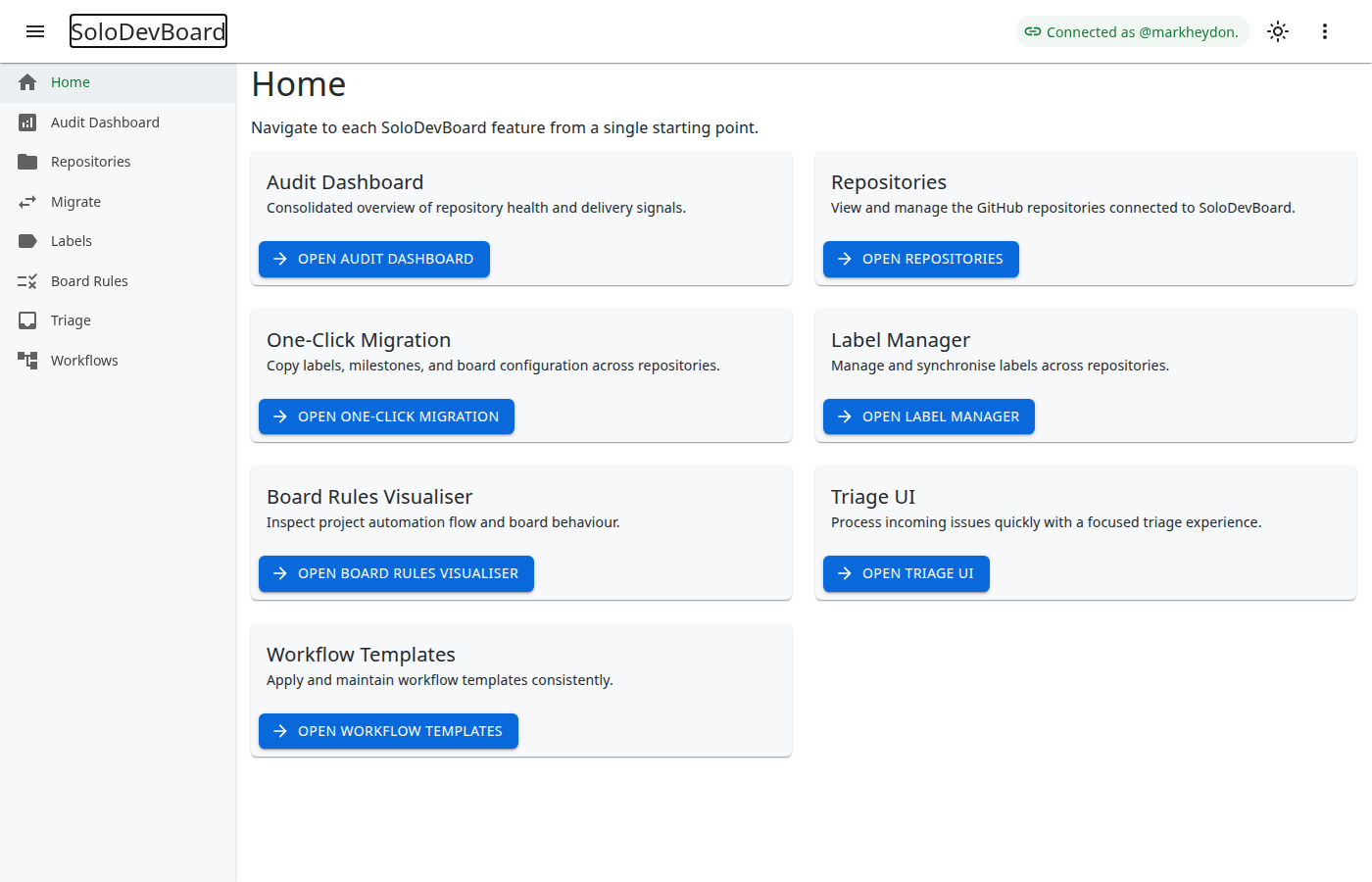
Theme modes
| Mode | Behaviour |
|---|---|
| Automatic (default) | Follows your operating system’s light or dark colour scheme. |
| Light | Always uses the light theme. |
| Dark | Always uses the dark theme. |
Changing the theme
- Open any page that uses the main application shell (for example, Repositories or Audit Dashboard).
- Click the theme button in the app bar (the icon changes to reflect the current mode).
- Each click cycles through Automatic → Light → Dark → Automatic.
The button’s accessible name describes the current mode and the mode that will be activated next (for example, Theme: light. Activate dark mode.).
Persistence
Your selected theme mode is stored in the browser and restored on the next visit. Clearing site data for SoloDevBoard resets the preference to Automatic.
The hosted sign-in landing page uses the same stored preference but does not include a theme button in the app bar.
Last updated on